 TV Time
Custom Lists
Redesigning TV Time's Custom Lists feature to be more intuitive, more personal, and more shareable, lifting list creation by double digits across new and existing users.
Overview
TV Time is a tracking app for movies and TV.
It’s available on iOS, Android, and web. Over 16 million users across the globe use TV Time to:
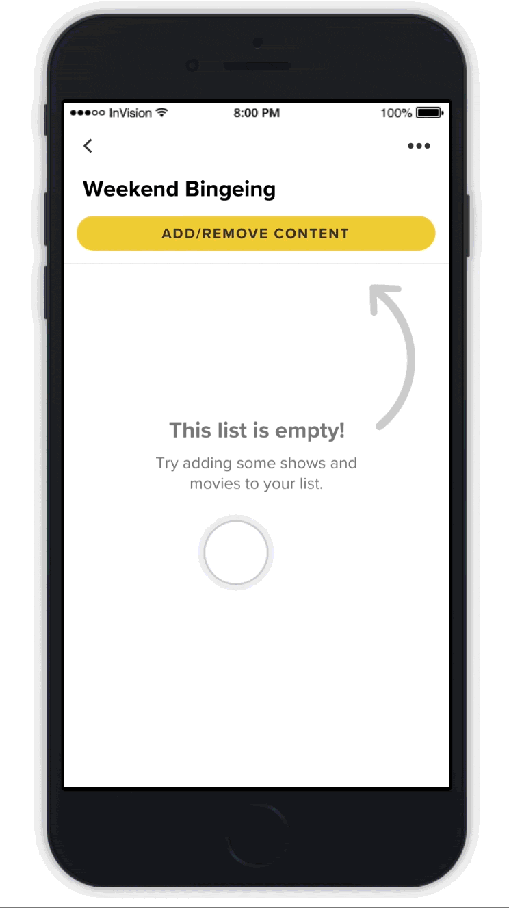
TV Time has a Custom Lists feature that allows users to curate lists of content for them to watch later, or to collect content according to a theme. Users can create, edit, and manage custom lists of TV shows and movies.
The Problem
Redesigning Custom Lists
The design team was tasked with redesigning the Custom Lists feature on the TV Time mobile apps to include additional requested features and make it easier to use, in order to:
- Increase user engagement with more custom lists created and shared.
- Increase organic growth by allowing sharing of custom lists.
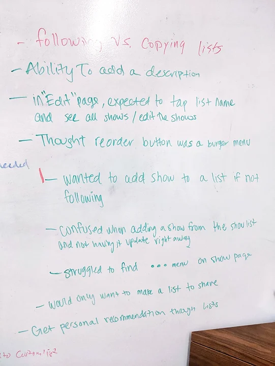
Understanding user pain points
The UX team had previously conducted internal user testing on the existing version of Custom Lists. We revisited the findings from those tests and identified two main themes around user pain points.
Confusing information architecture
- 75% of participants expected to be able to create a new Custom List from the main Custom Lists screen.
- All participants found the location of certain functions (renaming lists, editing contents of a list) were not where they expected.
Difficulty adding shows to a list*
- 50% of participants wanted to add shows they weren’t following to a list.**
- 75% of participants were confused by the lack of feedback when adding a show.
- All participants found it difficult to navigate the list of shows to add: there were no sorting or filtering options.
*This testing was done before Movies were introduced. For the redesign, we had to also consider Movies.
**In the current version, users could only add content they were already following to a Custom List.
Discovery
Learning what users want
We also wanted to explore potential ways to improve user adoption and engagement for Custom Lists. For this, we ran an internal interview with test participants. The question we wanted to answer was:
How might we make Custom Lists into a feature more users would want to use?
From the interviews, we found that:
- Users were attracted to the social aspect of Custom Lists.
- Users wanted more personalization options for their Lists.
Specific features suggested by participants included:
- The option to create a private List.
- The option to add a description to a List.
- The ability to copy other people’s Lists.
We were also able to validate that allowing users to share lists could improve engagement and adoption. One participant even mentioned they did not have the motivation to create a Custom List unless they could share it.
Existing user flow
Since one of the key user pain points was confusing information architecture, we put together a user flow of the existing Custom Lists to better visualize problem areas and identify opportunities for improvement.
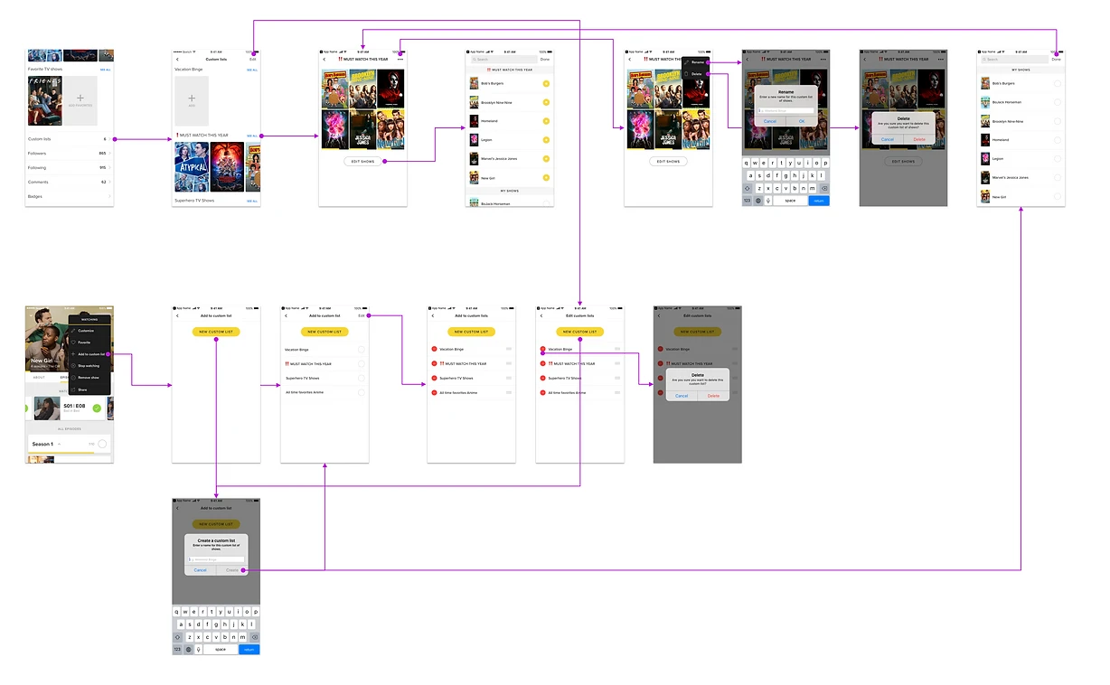
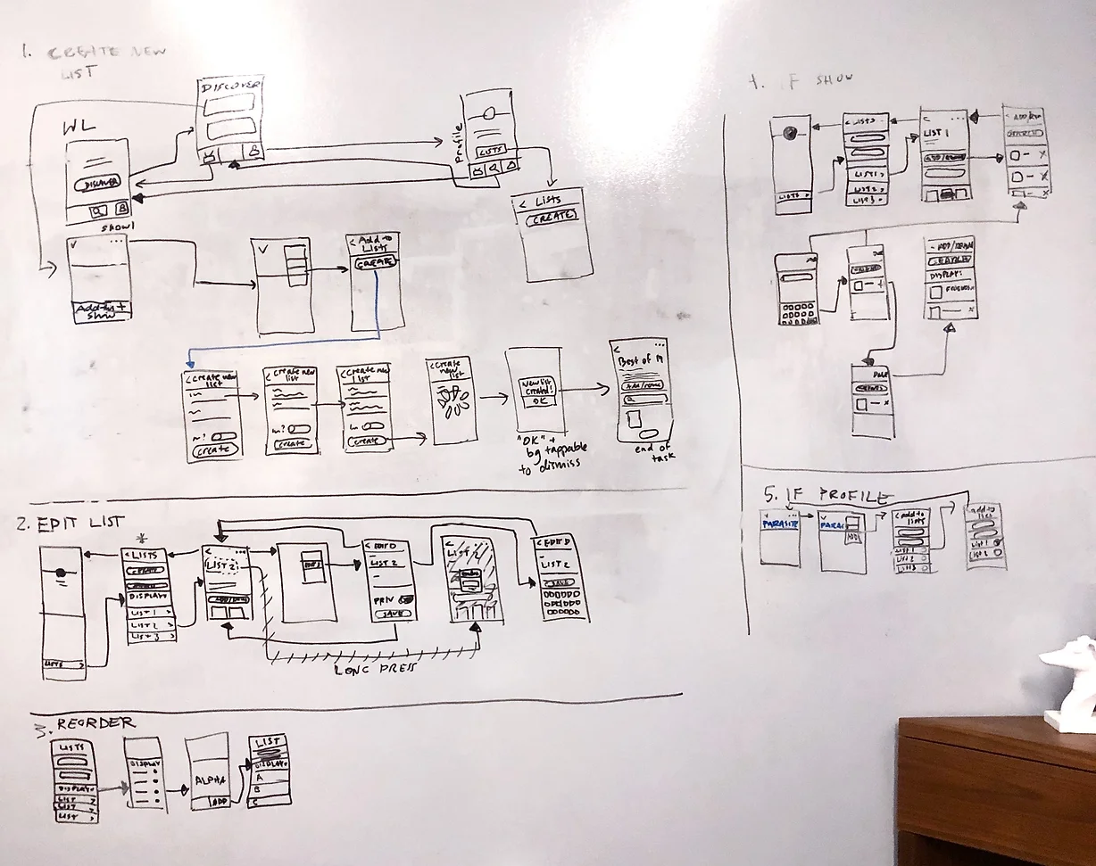
New user flow
Armed with our research findings and the old user flow for reference, we held a few whiteboarding sessions to sketch out ideas for a new user flow. Here’s mine.
Wireframing
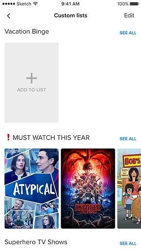
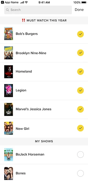
Mid-fidelity screens
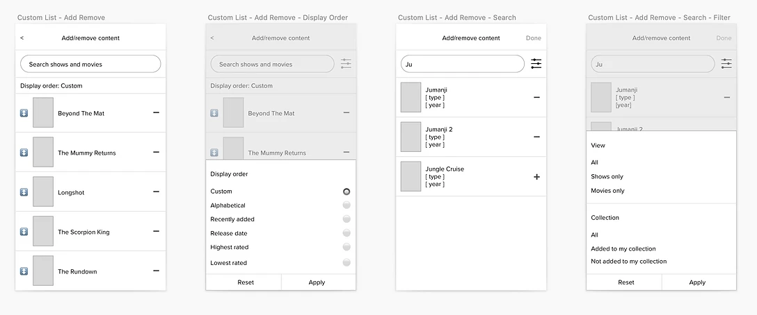
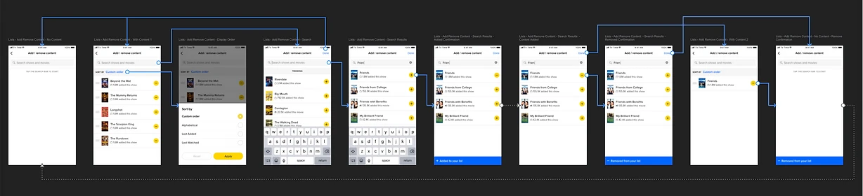
When it came time to flesh out our ideas with wireframes, we divided up the screens and worked on them individually in Sketch. I focused on the List Details screen, as well as the flow to add and remove content to or from an existing list.
User testing: round 1
I combined all our wireframes into an InVision wireframe prototype for user testing. For this initial round, we mainly wanted to validate the updated information architecture and user flows. We found that:
Updated IA and functionality were intuitive and well-received
- 75% of participants liked the additional personalization options (list descriptions, public/private toggle, sorting and filtering).
- All participants were able to easily find and use functions that were previously in unexpected locations (creating a list, renaming a list, editing list contents).
Reordering lists could be improved
- 75% of participants were confused by what certain reordering options meant (particularly “shortest/longest duration”).
- 75% of participants wanted to be able to reorder their lists in ascending or descending order.
High Fidelity Designs
Translating to high-fidelity flows
Having validated our new user flow, I began to translate the mid-fidelity screens into detailed, high-fidelity designs, while also iterating based on feedback from user testing. The high-fidelity screens were arranged into the same two flows.

User Testing: Round 2
Validating the high-fidelity prototype
I built a high-fidelity InVision prototype for a second round of remote user testing. The goal this time was to validate the changes we made and identify future improvements.
It was at this point that the pandemic hit, and we began working from home. We had originally planned for an in-person round, but had to figure out a workaround to conduct it remotely. Participants interacted with the mobile prototype via a web browser on their computer instead of on our test phones. We kept that detail in mind as it could potentially affect our results.
IA remained intuitive
All participants were still able to easily find and successfully use Custom List functions, describing the experience as “easy to use,” “intuitive,” and “straightforward.”
Updated functionality was well-received
- All participants were now able to reorder lists with minimal confusion, and appreciated the ability to toggle between ascending and descending order.
- 75% of participants liked being able to filter the content of their lists, a functionality we added to make longer lists easier to parse.
A potential larger issue: discoverability of Custom Lists
All participants mentioned that Custom Lists were hard to find and relatively hidden. Since this was related to the structure and navigation of the app itself, we considered it out of scope for this project but kept it in mind for any future app restructuring.
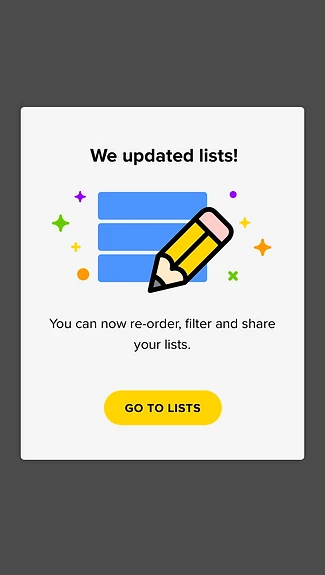
Instead, we designed a Custom Lists in-app announcement to introduce users to the new and improved Custom Lists, with a CTA to navigate them straight in.
Opportunities for future improvement
The following were mentioned by participants as features they would like to see for Custom Lists. We considered these out of scope for now but noted them as potential future improvements:
- Tagging functionality for lists.
- Collaborative lists that allow multiple users to manage a list.
- Being able to like or vote on a list.
- Featuring lists in a visible place in the app (whether it’s “most popular” lists or TV Time-curated lists).
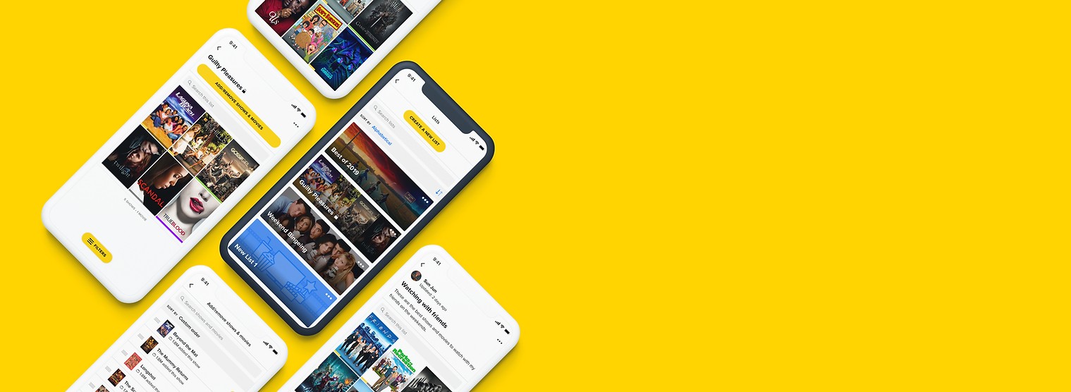
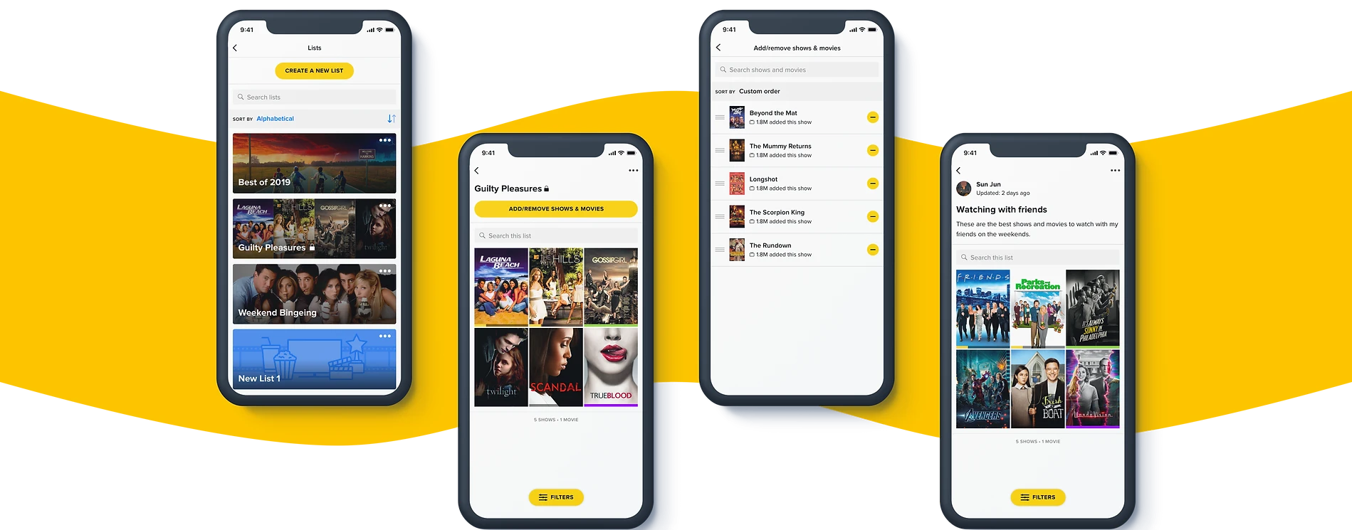
Introducing: new Custom Lists
After one last round of design clean-up, we had our new version of Custom Lists.
Improvements and additions
Our solution addressed both user pain points and user wants, and in the process of addressing both, we were able to also satisfy business goals. The new and improved Custom Lists included more intuitive information architecture, clearer editing controls, new social features, and new personalization options.
New social functionality
- The ability to share lists.
- The ability to copy others’ lists.
Additional personalization options
- The option to create a private list.
- The option to add a description to a list.
Success!
After conducting an A/B test on the new version of Custom Lists, we saw that the metrics moved in the right direction across the board.
↑ 14%
Increase in the number of new users who created a Custom List.
New-user adoption
↑ 15%
Increase in the number of Custom Lists created by new users.
New-user creation
↑ 10%
Increase in the number of Custom Lists created by existing users.
Existing-user creation
Reflection
Overall, I’m really happy with my work on Custom Lists.
This project highlighted the importance of user-centered design. It was initially driven by business goals (increasing user engagement and organic growth), but in addressing user pain points and wants, we were able to meet business goals in the process.
It also challenged me to balance feasibility and impact when iterating on designs. I found myself wanting to address all the user feedback we received, but doing so would have led to scope creep and would not have been feasible with the time and resource constraints we had. We worked closely with Product to scope the project, but we still weren’t able to include all the features we designed in the initial implementation. In the future, I hope to work more closely with Product and Engineering to design a more viable MVP, while still having a “north star” design to eventually work towards.