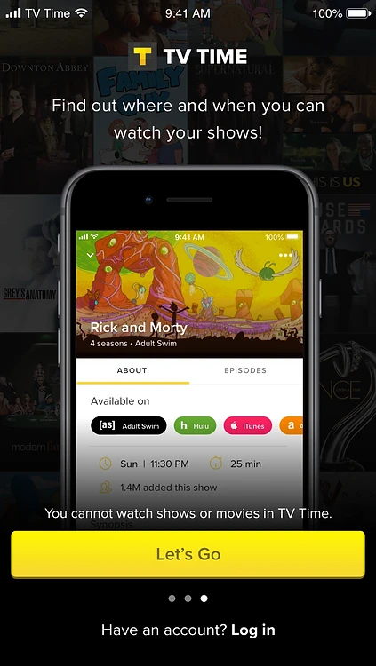
 TV Time
Onboarding Redesign
A week-long Design Sprint at TV Time to rethink onboarding around three user types, ending with a tested prototype that taught key functions, key benefits, and the core habit loop.
Overview
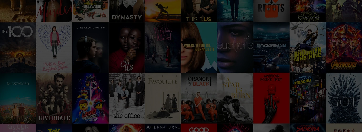
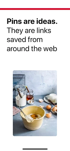
TV Time is a tracking app for movies and TV.
It’s available on iOS, Android, and web. Over 16 million users across the globe use TV Time to:
The Problem
A week-long Design Sprint
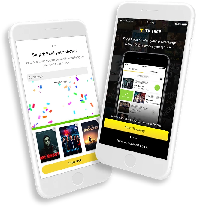
The current TV Time onboarding experience consists of hints that don’t educate users about all of the app’s core functionalities. We are missing an opportunity to help users understand why they need the app, what the app can do, the app’s most important features, and how to use those features.
In order to learn more about this problem and come up with a viable solution, the UX team held a week-long Design Sprint, culminating in the testing of a working prototype by the end of the week. Since my idea was chosen during the Sprint, I led the efforts in wireframing, designing, and prototyping my solution to be tested.
Understanding TV Time users
In preparation for the Sprint, we were encouraged to do some general research around mobile app onboarding and TV Time users so that we could come to the Sprint well informed and hit the ground running.
Our UX researcher had previously conducted a survey amongst TV Time users, asking their main reasons for using TV Time, both for movies and TV shows.
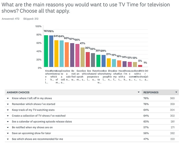
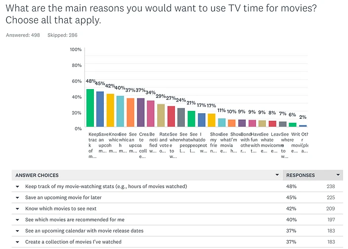
What the survey told us
The results showed that the top reasons cited by users for using TV Time were related to tracking: keeping track of movie and TV stats, knowing where you left off on your shows and which shows you’ve started, knowing which movies to see next, and so on.
Pre-Sprint Research
Mobile app onboarding
I did some reading on mobile app onboarding methods and techniques. I found that there were three types of onboarding.
Benefits-oriented
Describes the benefits of using the app and informs the user on how to benefit from it.
Function-oriented
Specifies the main functionality of the app, when you can use it and how. Focuses on helping the user get started.
Progressive
Onboarding presented during the actual usage of the app. It relies on the idea that users learn more by doing.
Common techniques
- Inline hinting gives users the freedom to explore, while progressively disclosing various features.
- Tooltips are similar to inline hints; they progressively disclose product features and are easily dismissible.
Slides, wizards, and tutorials
- Slides. Slideshows, showcases, and explanatory screens are good for benefits-oriented onboarding, but won’t give users the real experience.
- Wizard. Multi-step walkthroughs with the goal of setting the user up before dropping them in the app.
- Step-by-step tutorials. Guide the user in an interactive way, usually towards accomplishing a core habit loop within the app.
- Hybrid. A combination of the above techniques.
A wizard sets users up before dropping them into the app.
Understanding TV Time users
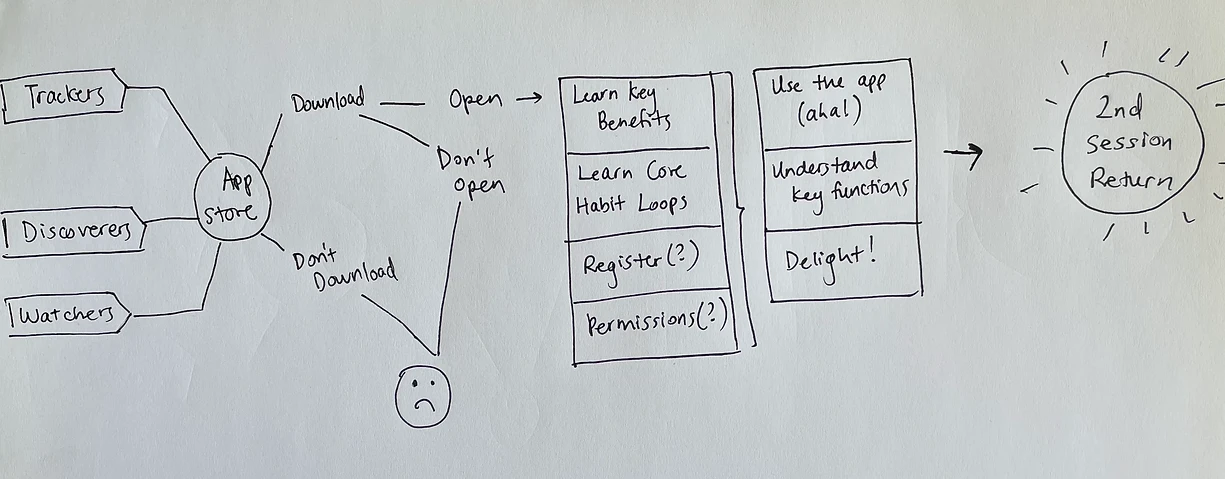
We spent much of Day 1 mapping out the challenge, starting first at the end by agreeing to a long-term goal:
All users come away from their first session understanding key function, key benefits, and core habits.
We then identified three core user types of TV Time, using data gathered from prior user research.
Trackers
Users that predominantly use TV Time to keep track of their shows and movies.
Discoverers
Users that predominantly use TV Time to find new content to watch.
Watchers
Users that think they can watch shows and movies on TV Time.
The map
Then we identified the completed goal: 2nd session return. Upon filling in the paths between the users and the ultimate completed goal, we had our map.
Day 1 (cont.)
How might we…
The next part of the exercise involved reframing potential issues as opportunities on sticky notes, organizing them, and voting on them.
-
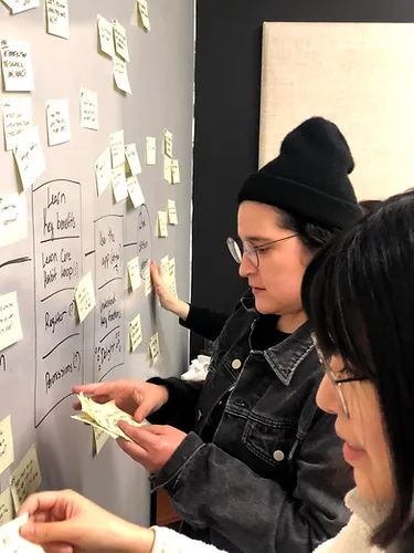
HMW sticky notes
-
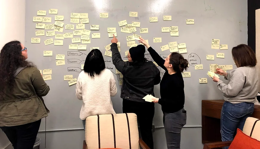
The four we picked
The four HMWs we picked
Out of a sea of sticky notes, we highlighted a select few to focus on:
- How might we determine user intent and personalize the onboarding flow to that intent?
- How might we better align onboarding with the actual app?
- How might we define and narrow the key behavior, the core habit loop we want to teach?
- How might we make it feel rewarding right away?
Lightning demos
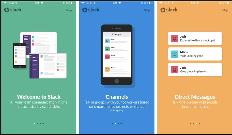
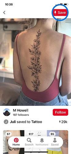
The day started with each of us giving a quick demo of an app with a good onboarding experience. I chose Pinterest, as it does a great job of guiding new users to accomplish their core habit loop: creating a pin.
Through the use of tooltips and a step-by-step tutorial, Pinterest was able to quickly teach me about its functionality, explain the core habit loop, and ultimately communicate the value of the app: creating pins and boards allows me to curate and collect content for future reference.
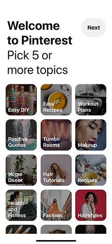
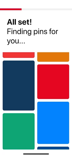
After registration, Pinterest prompts you to choose 5+ topics of interest. While you wait, they explain what pins are.
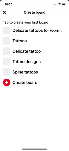
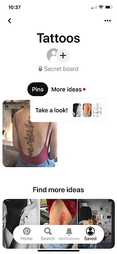
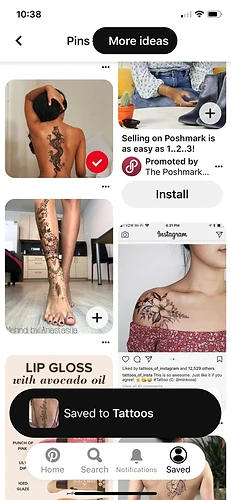
Then they walk you through saving your first pin, creating your first board, and adding more ideas.
Sketching solutions
After our demos, we split up and spent some time individually taking notes and brainstorming. I first reviewed what we had so far and jotted down some notes and ideas.
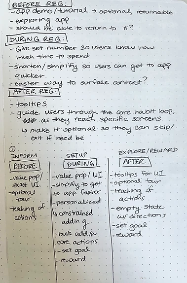
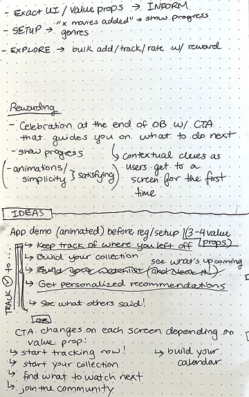
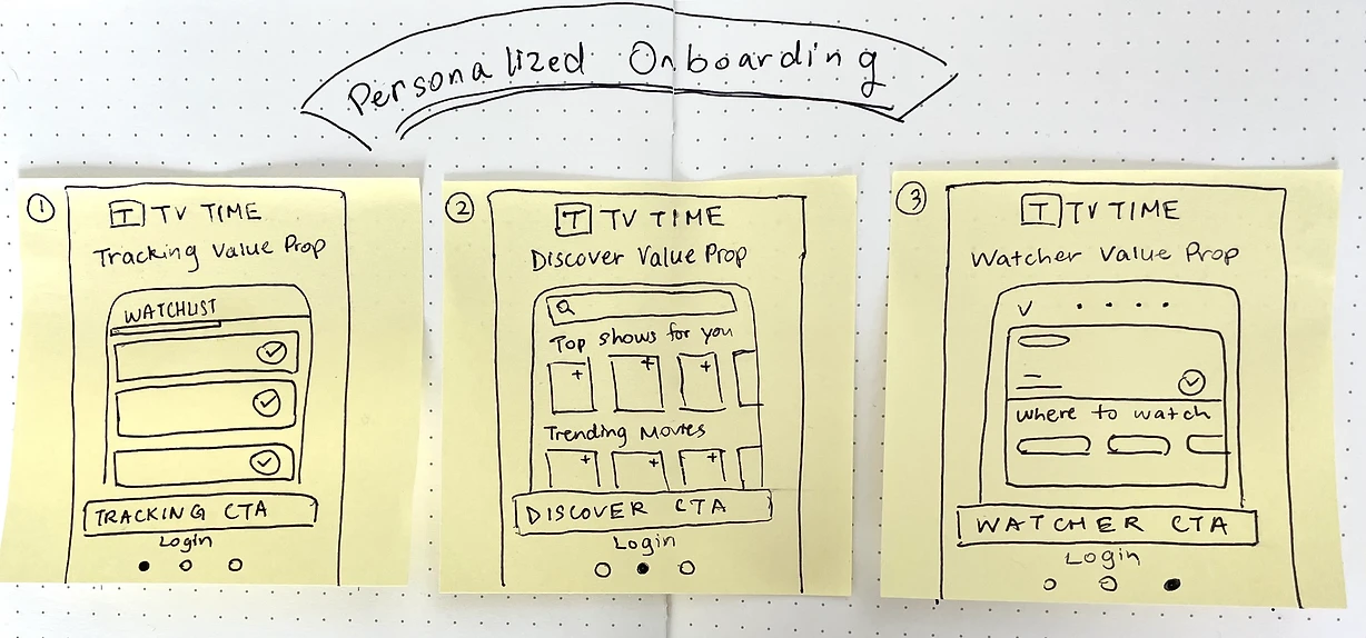
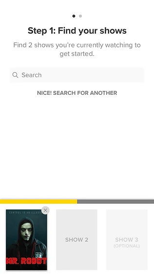
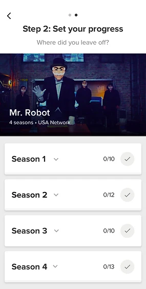
The three-panel sketch
Then it was time for the solution sketch. We were tasked with creating a three-panel storyboard by sketching in three sticky notes on a sheet of paper. Here’s mine.
Deciding on an approach
By the beginning of Day 3, we had a stack of solutions. Since we couldn’t prototype and test them all, we had to evaluate and decide on an approach to move forward with. The team spent some time critiquing each solution and then voting on them. The result?
My idea was a winner!
It was one of two solutions we decided to move forward with. Since it was chosen, I got the opportunity to walk the team through what I was thinking in more detail, and receive feedback.
Personalized onboarding
The main idea behind this approach is to provide a personalized onboarding experience depending on the type of user.
- A user would tap the CTA based on the value prop most appealing to them on the registration screen.
- The onboarding experience that follows would be tailored to that value prop.
- Once they’re done, they’d be dropped at a place in the app most relevant to their user type.
Strengths of this approach
- It addresses the key HMWs we identified earlier: determining user intent and personalizing onboarding to that intent, and defining and narrowing the core habit loop we want to teach.
- It allows us to provide value for all user types, not just Trackers.
- It teaches users the value of tracking as it relates to their specific user type or use case, framed as a core habit loop.
Areas to keep an eye on
- Because onboarding will be targeted and personalized, users may not get a chance to learn about other areas of the app.
- Users may just tap the first CTA they see to get started, rather than choosing based on the area they’re most interested in. This could be okay if we make sure to prioritize the screens. We know Trackers are our top users, so that can be the first screen.
Wireframing
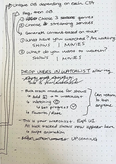
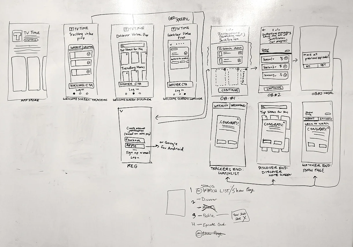
The rest of the flow
I spent the afternoon sketching out the rest of the flow for my Personalized Onboarding solution, with collaborative input from the rest of the team.
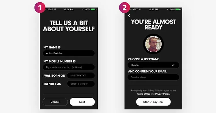
High-fidelity designs
With a focused approach, I spent the first half of the day translating my wireframes into hi-fidelity screens. (They don’t call it a sprint for nothing.)
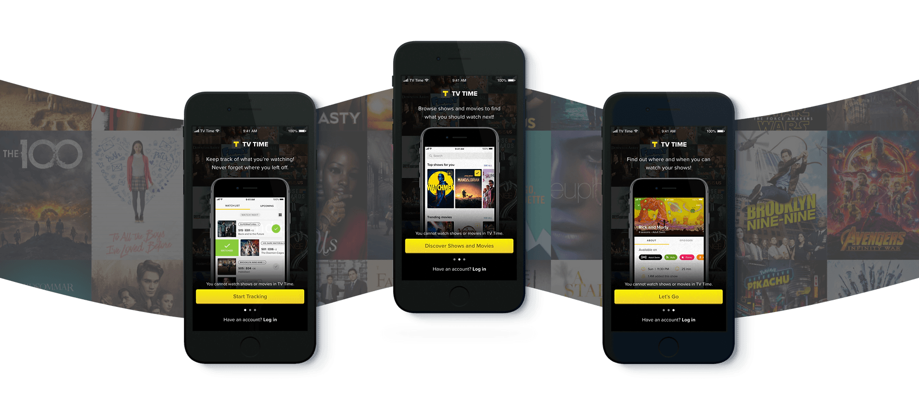
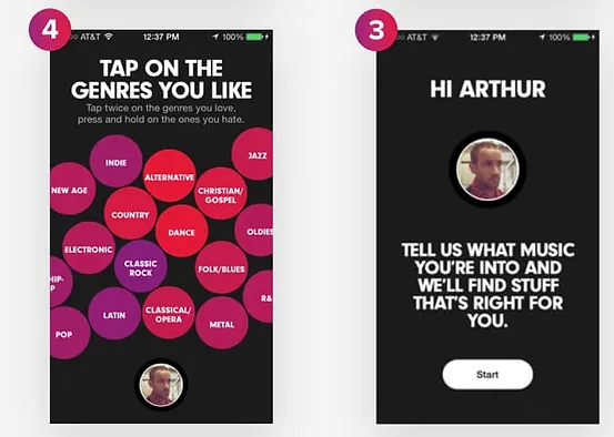
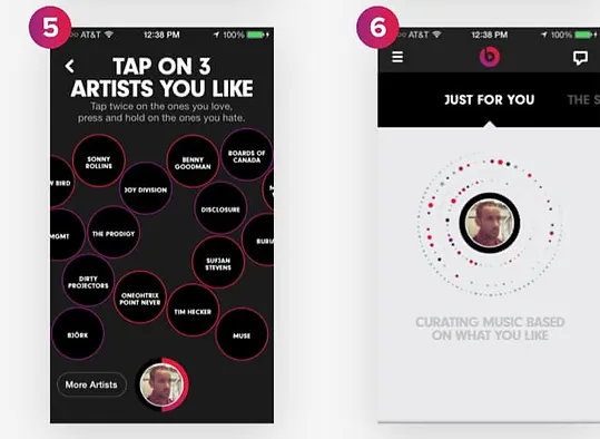
Three unique flows
Due to the three personalized “tracks” of the onboarding flow, I had to build out three unique flows for the prototype. I worked closely with our assigned Sprint Copywriter to personalize the copy in each flow.
-
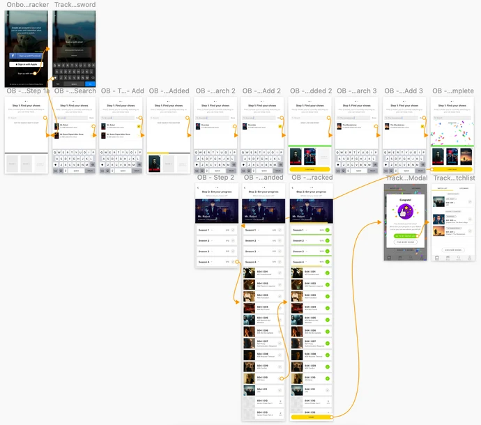
Tracker flow
-
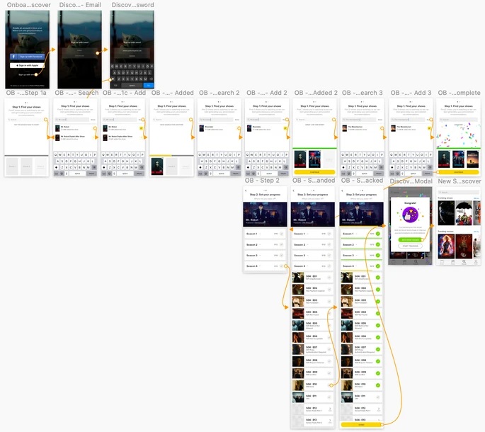
Discoverer flow
-
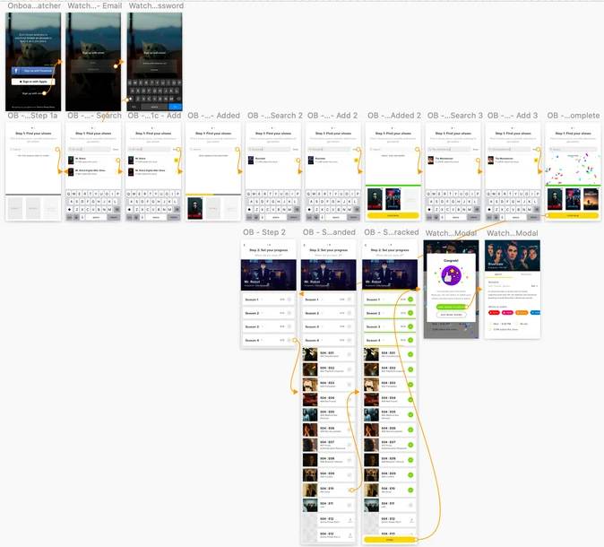
Watcher flow
Methodology
Since the goal of the Sprint is to allow us to quickly ideate and evaluate potential solutions to our problem rather than come up with a final solution to be implemented, our focus in user testing was to evaluate the general concept of the solution and how effective it was in achieving our long-term goal:
All users come away from their first session understanding key function, key benefits, and core habits.
As part of this, we counterbalanced the prototypes with sessions in the actual app to see if users could understand how to use the actual app better after interacting with our onboarding prototypes. We also made sure to recruit new users; people who weren’t already familiar with the app.
Results: success!
Our testing found that the prototype was mostly successful.
The new onboarding flow was mostly effective in meeting our long-term goal
- All participants understood the key functions of the app by the end of the session.
- All participants understood the key benefits of the app by the end of the session.
- 50% of participants were familiar with tracking (our core habit loop) by the end. All participants came away knowing how to search and add shows.
Users understood the real app better after the prototype
- All participants understood how to search and add shows in the real app.
- 50% of participants immediately and easily knew how to accomplish other tasks in the real app.
One participant noted that compared to the real app and the other prototype, mine had more guidance and explained the app better. It also felt easier to understand and use.
Areas of concern
Testing also flagged a couple of areas where users got tripped up.
Users thought they could watch in-app
- 75% of participants came away thinking you could watch shows or movies directly in the app, despite messaging on the welcome screens saying otherwise.
- All participants who followed the Watcher flow came away understanding that you couldn’t watch in the app, but that the app could direct you to where you could watch.
Users did not swipe on the first screen
- 75% of participants did not know about the swipe functionality on the welcome screen that allowed them to view different CTAs.
- We had suspected this might be the case and put the Tracker flow first to help drive the tracking use case.
- An auto-scroll was also added to the welcome screens to make the feature more discoverable.
Feature in development
We’re still working on revamping TV Time’s onboarding flow, but the work and findings from this project have been highly valuable in informing that redesign.
100%
Of participants understood the app's key functions by the end of the session.
100%
Of participants understood the app's key benefits by the end of the session.
50%
Of participants were familiar with tracking, the core habit loop, by the end.
Reflection
This was my first design sprint, and I really enjoyed the process. It was a week of close, creative collaboration with members of the UX and Product teams, and without any external distractions, which I found to be productive and fun.
There were a lot of things I was proud of with this project: from the amount of progress we made in a week, going from an idea to a fully functioning prototype by the end, to the fact that I was able to lead efforts in the development, design, and execution of my idea.
The time constraint challenged me to work quickly and smartly. I had a day to wireframe the full flow and another day to build out a high-fidelity prototype, so I couldn’t afford to get bogged down with perfectionistic details.
If I had more time, I would have tried to personalize the onboarding experience further. Because of time constraints, the main difference we could build in across flows was the copy. I’d also have spent time designing a more interactive experience that would have been more fun for new users.