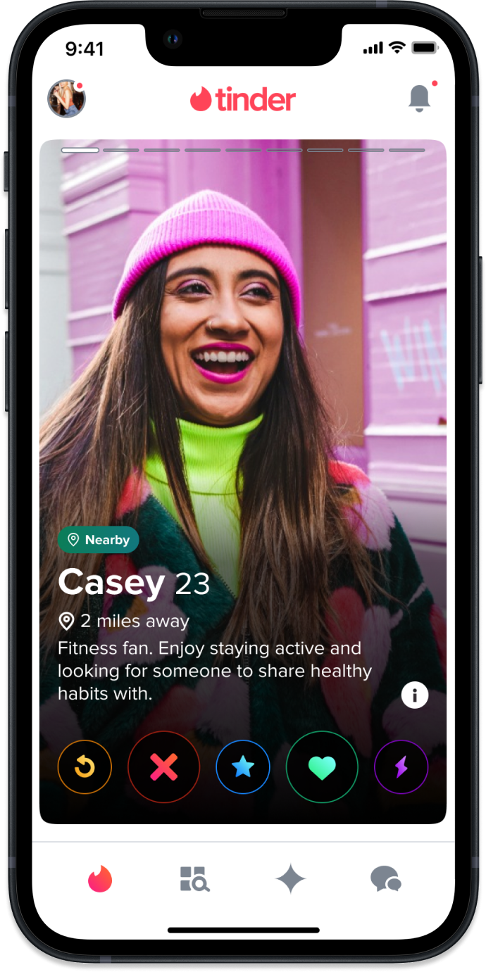
 Tinder
Tappy Cloud
Turning Tinder's static profile system into a backend-driven, dynamically configurable one. Six months, four milestones, and a centralized tool that has since powered 50+ experiments and around $50–110M in revenue lift.
Overview
Tappy, but smarter
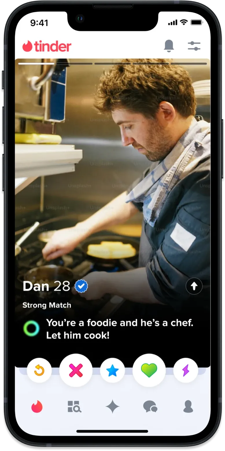
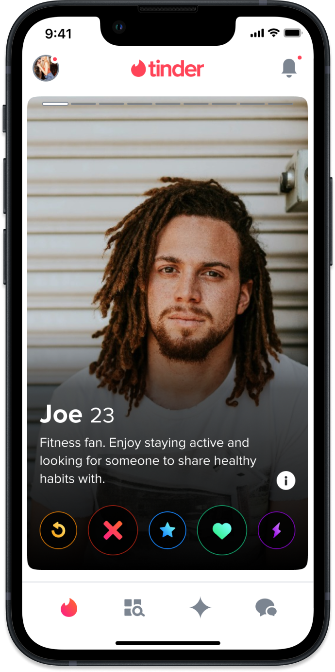
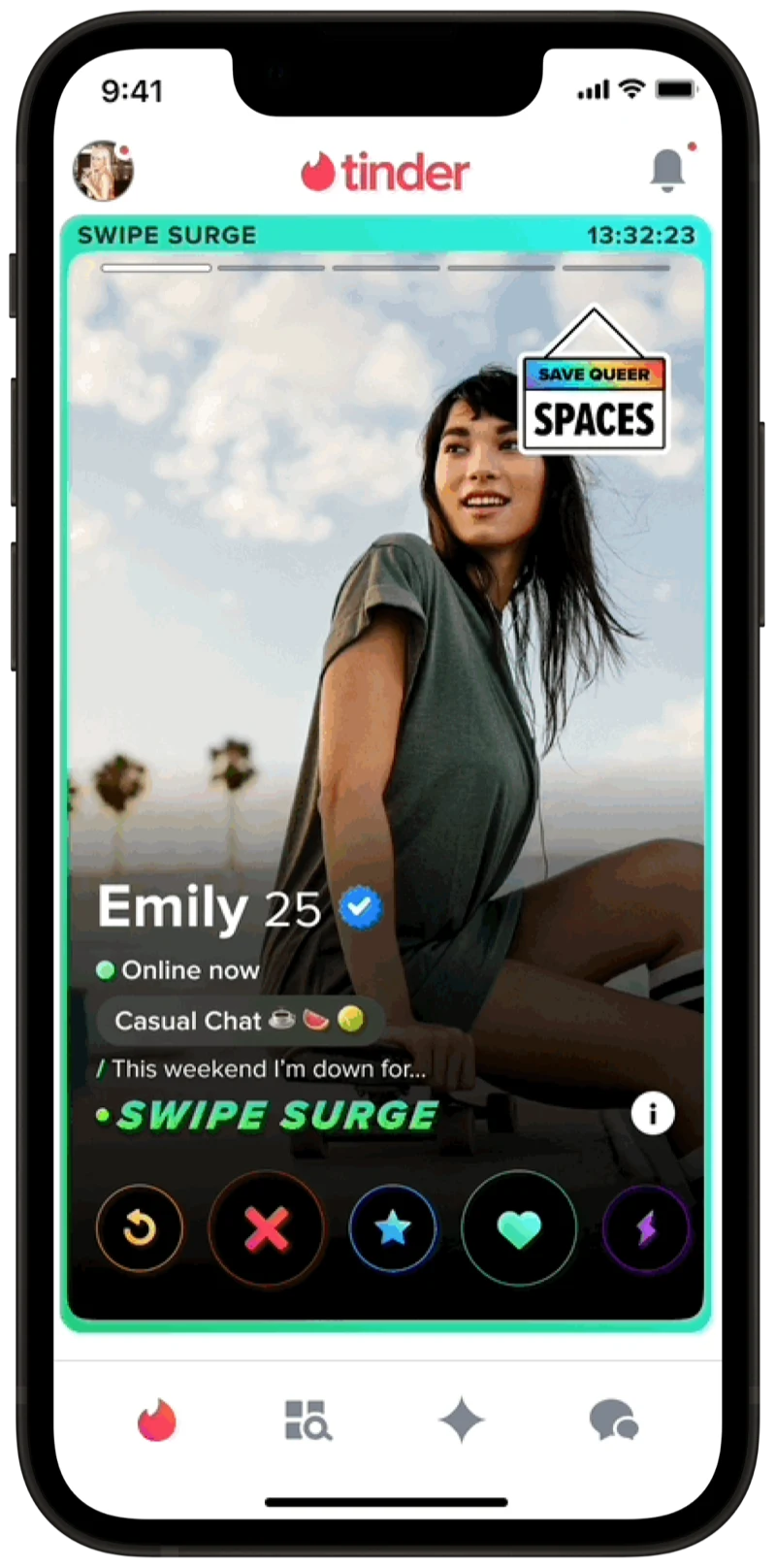
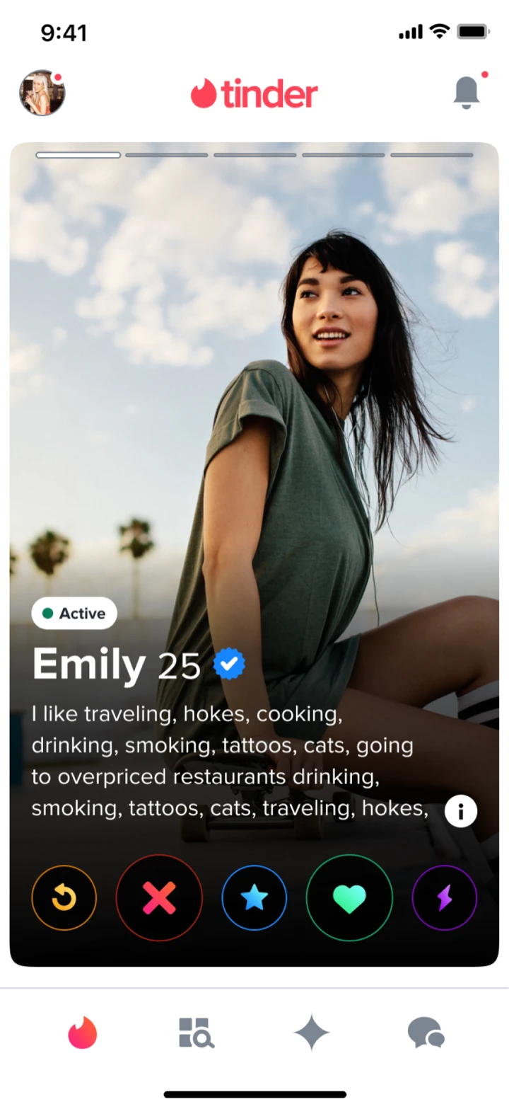
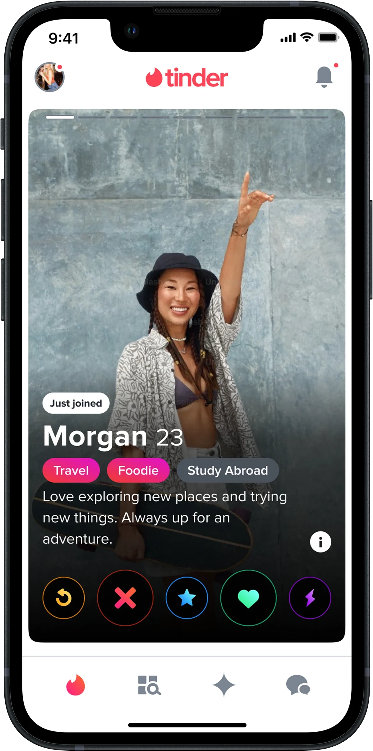
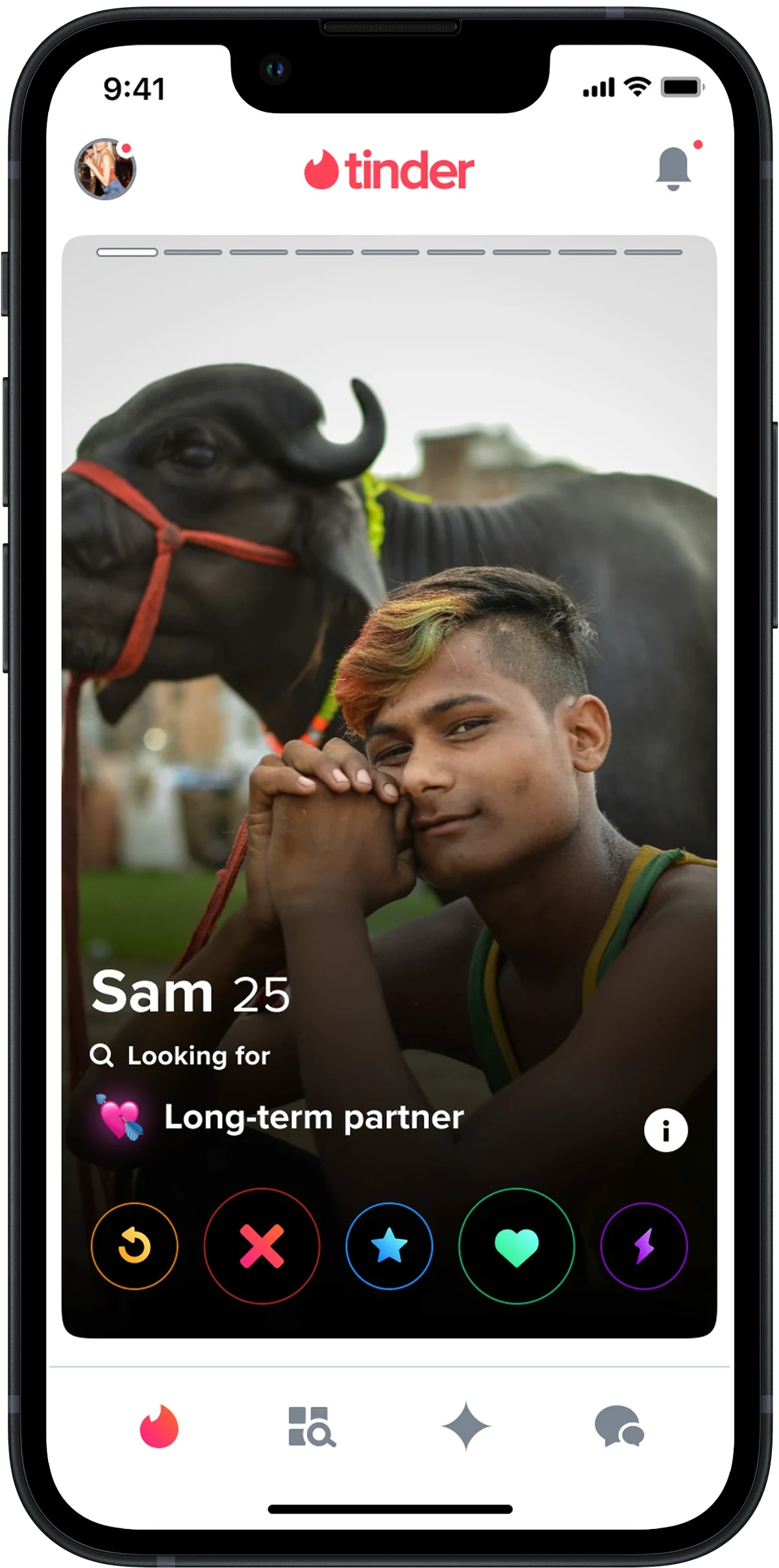
On Tinder, you tap left or right on a profile to flip through profile “pages,” each combining a photo with profile content. Internally, we call those tappable photo+content pages Tappy. Tappy was static, hardcoded, and hard to scale, so I led a six-month effort to turn it into a backend-driven, dynamically configurable system, with the tooling to match.
Three structural problems
At the time, Tappy suffered from three structural problems that limited both what users saw and what teams could ship. Tap through each below to see the kind of profile each problem produced in the wild.
Three goals, one system
The redesign had to move three things forward at once. Each goal mapped cleanly to one of the structural problems above, which is how we knew the solution had to be a system, not a feature.
Business
Create a centralized way for teams to preview and manage different Tappy content orderings.
User
Allow dynamic content ordering so we could surface the most relevant content to any given user.
Product
Establish UI guidelines for consistency, scalability, and reduced visual clutter.
What past experiments told us
Before designing anything, I pulled together prior analytics and ran fresh testing to ground the work in how people actually use Tappy.
96%
Of users only view content on Tappy itself, never reaching the longer profile detail view.
Tappy reach
2/3
Of users only view the first Tappy page.
First-page bias
<1s
Decisions on a profile often happen in less than a second.
Decision time
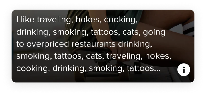
5 lines
Optimal length for a bio. Anything longer or shorter reduces the chance of a like.
Bio sweet spot
Research
Where attention actually lands
Card-sort and qualitative testing surfaced a clear hierarchy of what users look at, in what order, and why.
- Photos are king, then Tappy content. A photo can be the difference between an immediate pass and spending more time looking at the profile.
- Looking at subsequent pages signals interest. If the first page captures interest, users tap into more pages to see more.
- Bio was unanimously ranked the most important piece of content. Users use bios to assess personality, affirm authenticity, and gauge a profile’s seriousness.
- Job, school, location, and interests are also essential. Users look here for dealbreakers and commonalities. Beyond those, opinions varied.
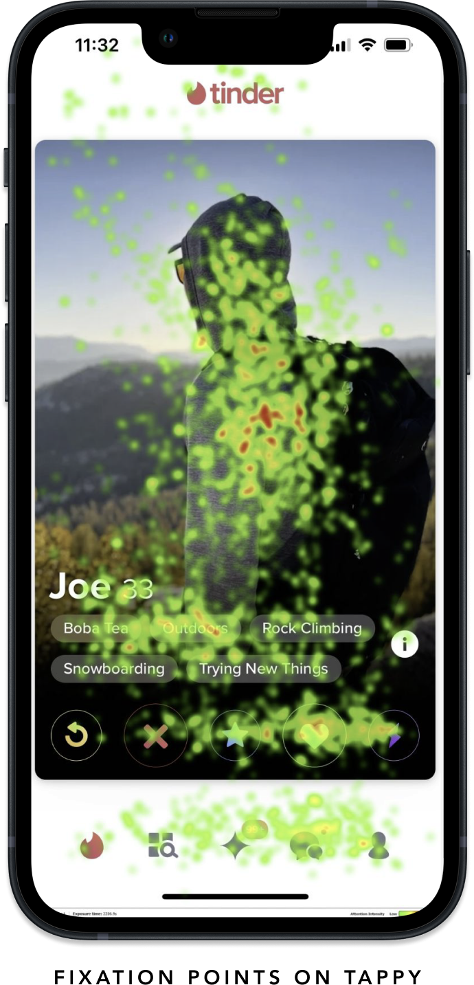
Men and women look at profiles differently
A round of A/B tests surfaced a strong gender split. Men preferred seeing distance first; women preferred bio first. Showing distance first for men led to revenue lifts of about 0.6% and a 0.4% increase in user satisfaction. The right ordering of content for the right user has a big impact.
What Joe sees
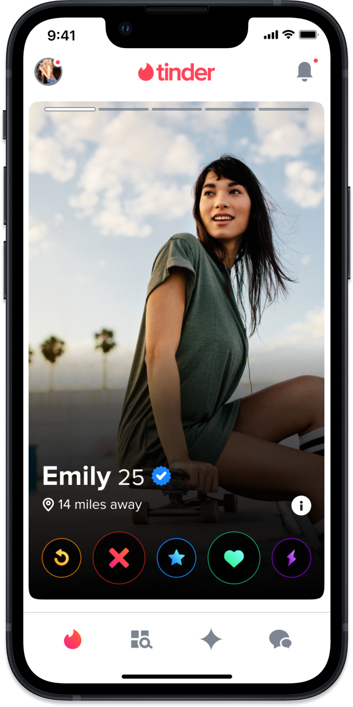
What Emily sees
Four design principles
Before we shaped the solution, the team aligned on four principles to steer every design decision.
Personalized
The solution should cater to individual user preferences and behaviors.
Scalable
Develop a system that can efficiently grow and accommodate new business or user needs.
Easy to use
Seamless for Tinder users, and easy for internal teams to adopt.
Unified
Maintain a cohesive visual language across the product.
Four milestones, sequenced for value
We sequenced the work into four milestones so the team could start unlocking value early without waiting for the full system.
Unifying content
Audit existing profile content, create profile content components, and write Tappy guidelines.
Building foundations
Client-side adoption of the new components, plus enabling backend-driven Tappy ordering.
Centralized tooling
Build an internal configuration tool, then use it to run our first series of content-ordering tests.
Rollout and integration
Onboard teams to the solution and work with them to fold in and test upcoming profile content.
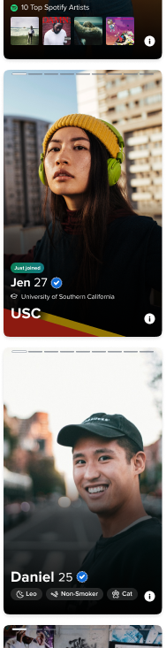
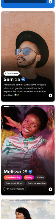
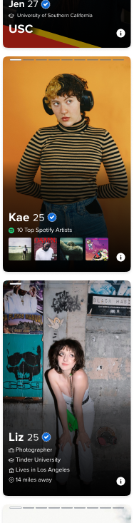
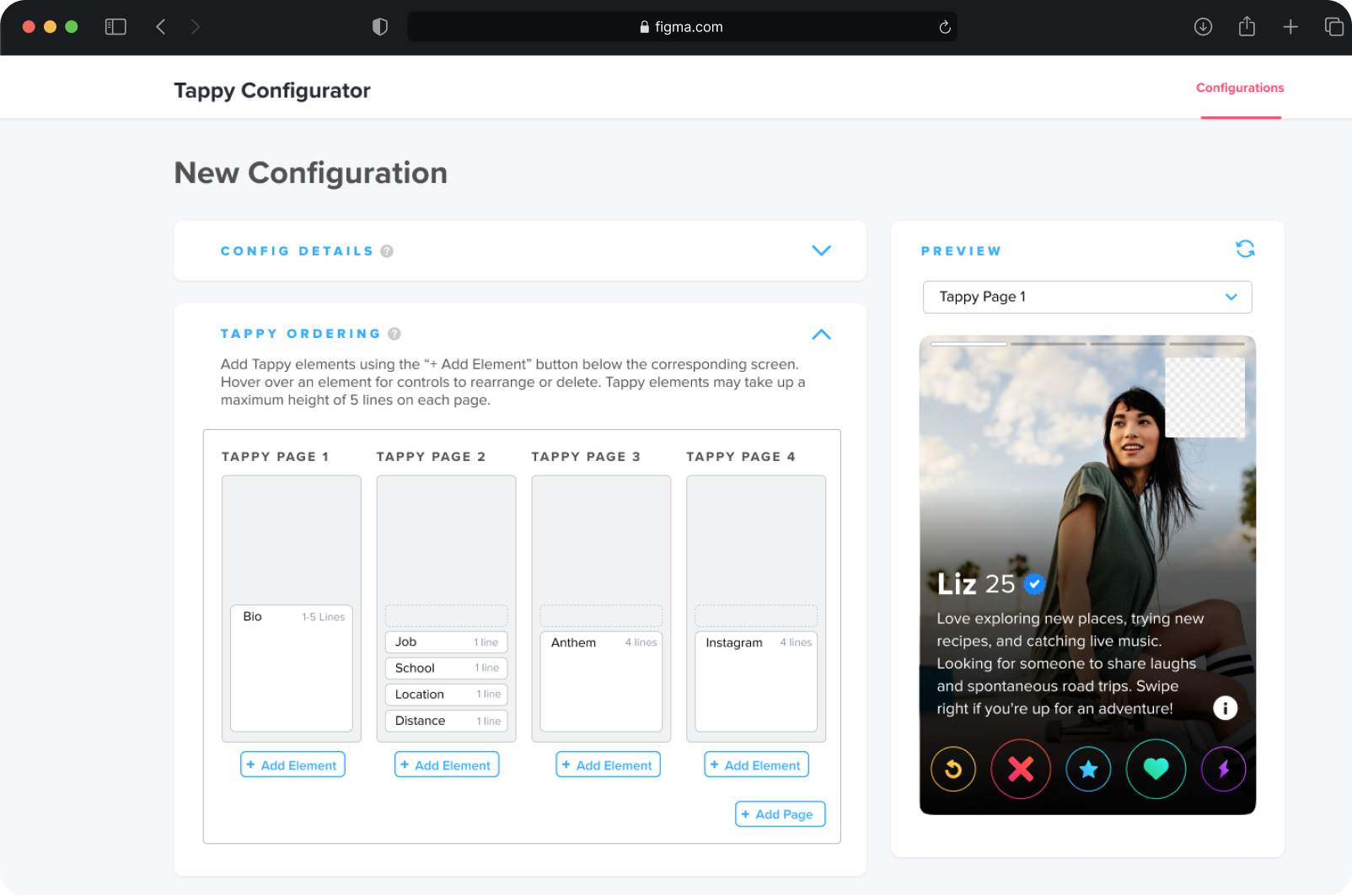
A small set of profile content components
The first milestone was making everything modular. I audited every kind of content that lived on Tappy and reduced the surface area to a small set of reusable components, each with a defined use and styling rules.
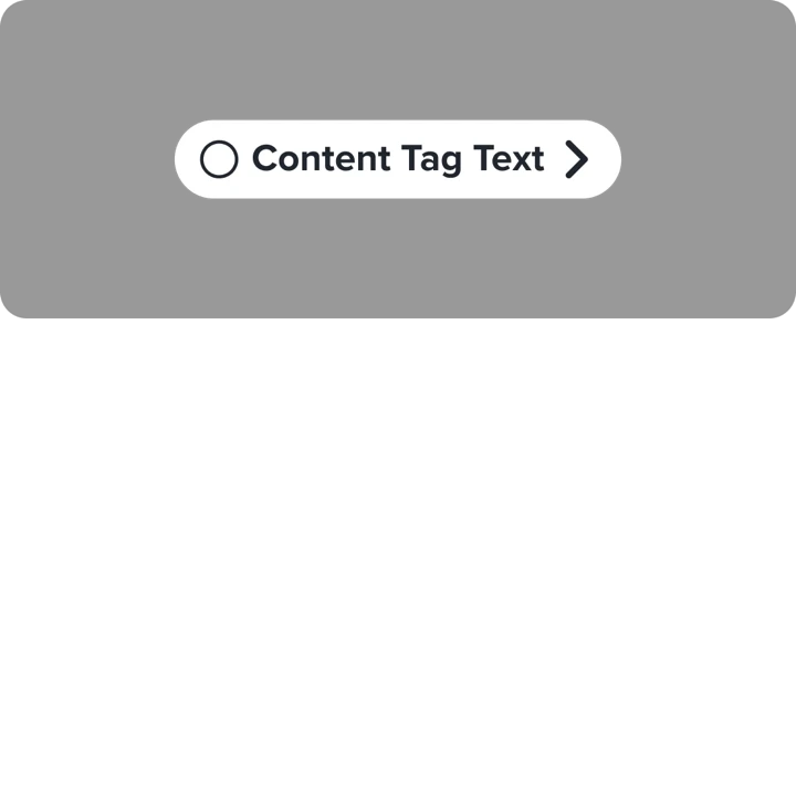
Content tag
- For system labels.
- Character max: 25 incl. spaces.
- One per profile, above the namerow.
- May include icon and pathing.
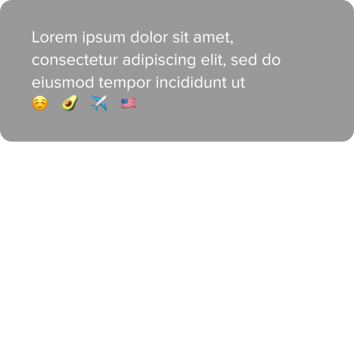
Body text
- Unstyled, multi-line.
- Truncates with an ellipsis.
- For bios and other freeform copy.
Text + icon
- Single line of text with a leading icon.
- Can be styled or stacked.
- For school, job, distance.
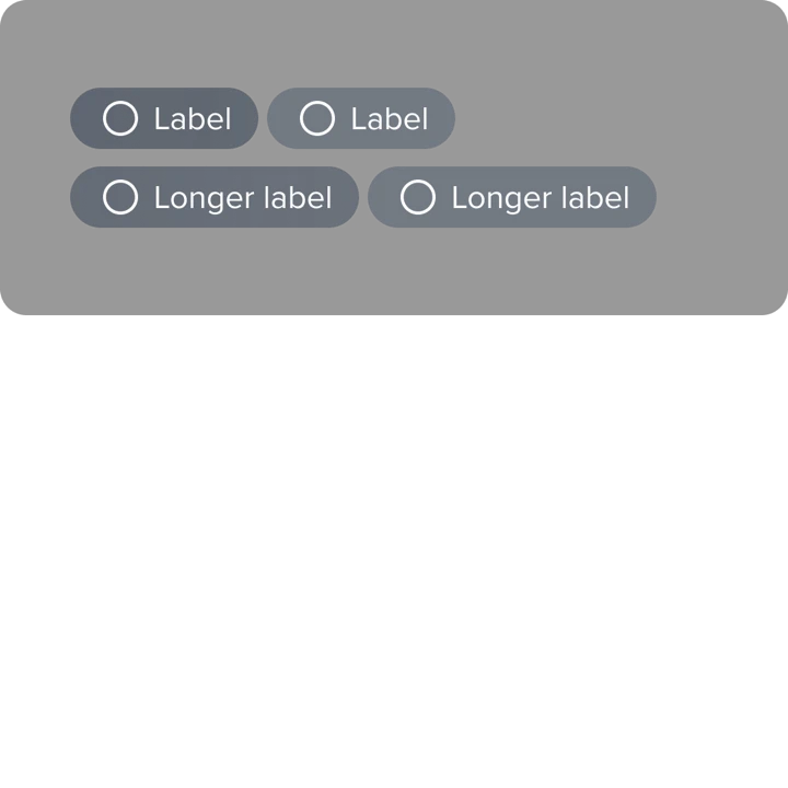
Pill labels
- Short labels in groups or stacks.
- Configurable colors, optional icons.
- For interests and lifestyle descriptors.
Image + icon
- Imagery with optional title and body text.
- For Spotify Anthem and Relationship Intent.
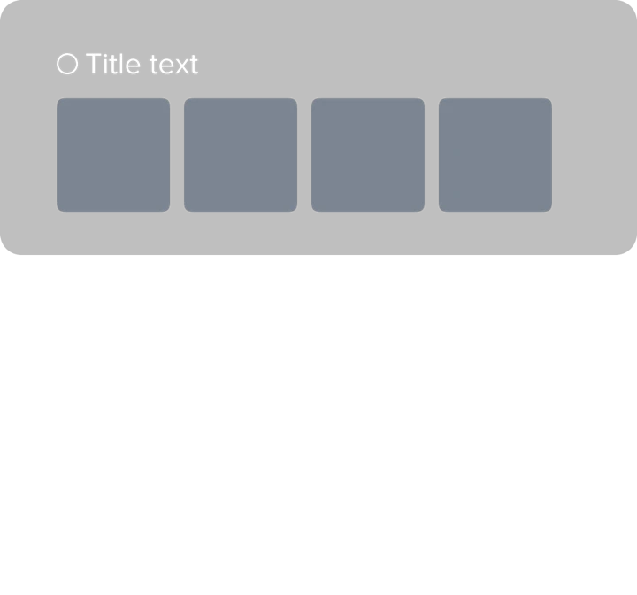
Image grid
- Up to four images.
- For top Spotify artists, Instagram.
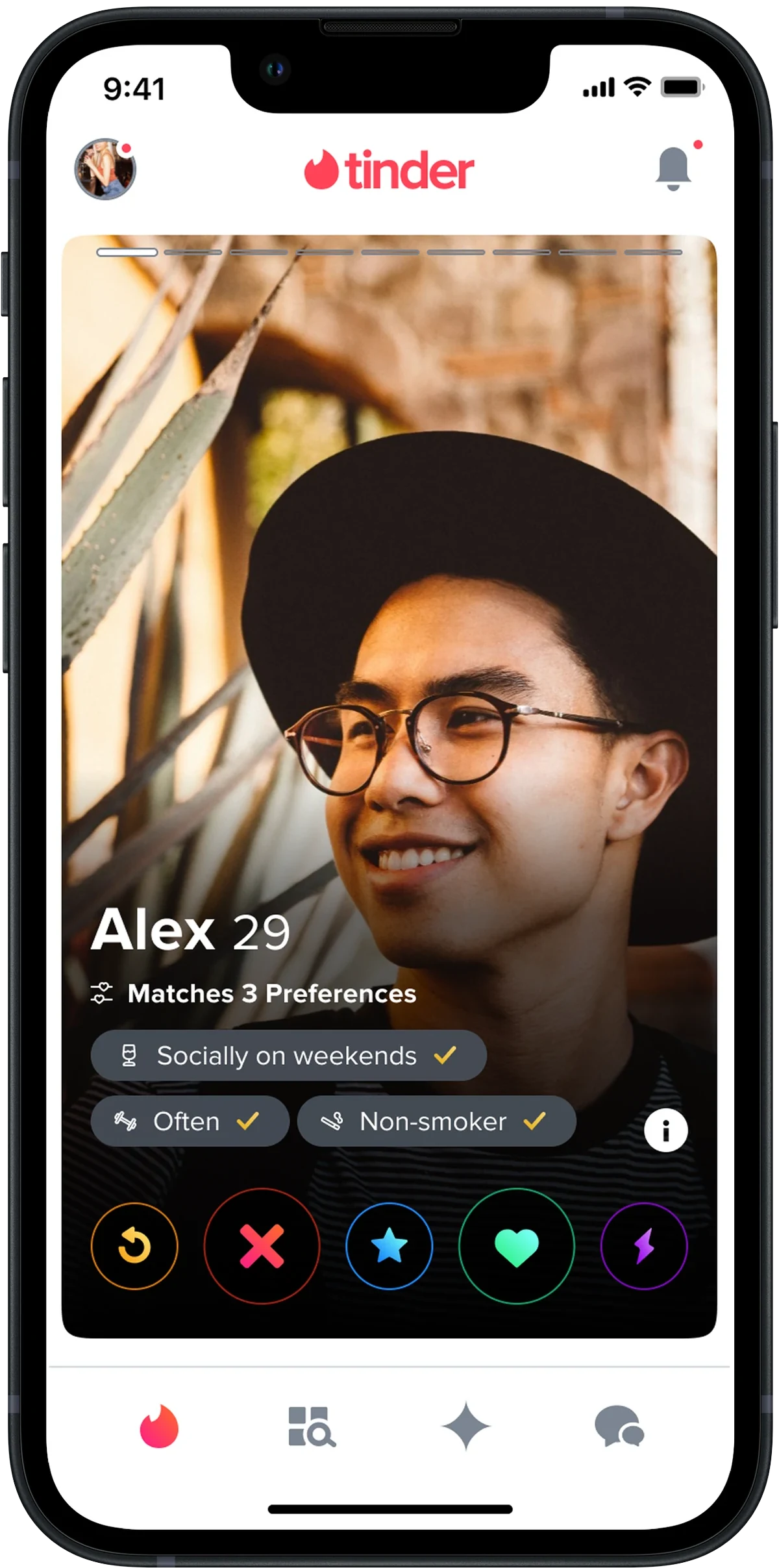
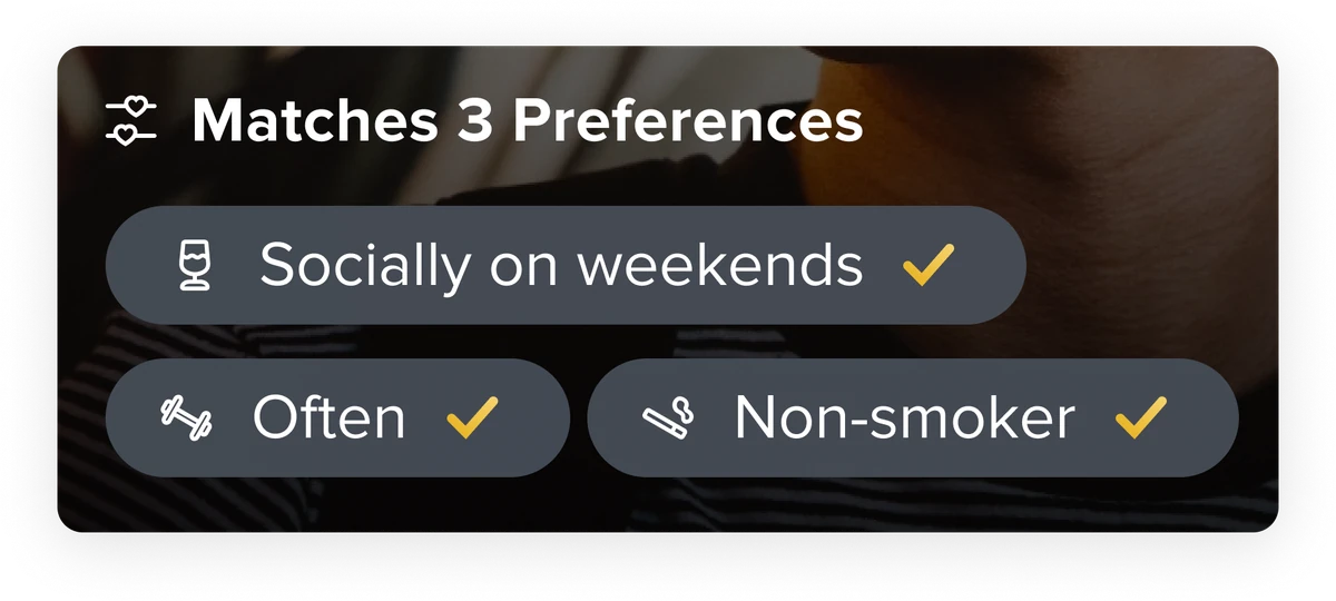
A new information architecture
Tappy’s new architecture splits a profile into three distinct zones, each with its own purpose. Tap through to see how each zone is anchored on a real profile.

Content maximums on Tappy
We needed guardrails so a Tappy page could be configured freely without becoming overwhelming. Each profile element got a “line height” from 1 to 5 based on its actual rendered height, and we capped a Tappy page at 5 lines. Test participants found a single mixed stack confusing and made incorrect swipes, so we kept stacking rules clear and let the system enforce them automatically.
Introducing TaCo, the Tappy Configurator
With the components and IA in place, the centralizing piece was a tool any internal team could use to configure Tappy.
Effortless ordering
Let teams effortlessly create and manage different Tappy orderings.
Live previews
Provide live previews of those orderings as they’re configured.
Built-in guardrails
Enforce content maximums to prevent profile overcrowding.
Experimentation-native
Integrate with our experimentation platform for easy A/B testing.
Testing TaCo with the people who'd use it
Target users were PMs, engineers, designers, and data scientists. We measured time on task, success rate, and the System Usability Scale.
100%
Success rate on core configuration tasks across all participants.
Task success
72.1
System Usability Scale rating, the highest of the alternatives we tested.
SUS rating
Fastest
Shortest time on task across the alternatives we tested.
Time on task
TaCo lets us run the right experiments quickly, and then run a lot of them. The numbers compound. By the most recent count, teams have launched 50+ Tappy experiments with TaCo. Across all experiments, profile personalization moved every metric we cared about.
↑ 20%
More likes sent across all experiments, translating to roughly $50–110M in revenue.
Likes sent
↓ 0.5%
Less time spent per profile, with no drop in match quality.
Time per profile
↑ 5%
Increase in user satisfaction.
Satisfaction
Impact
The most successful experiment so far
The standout experiment to date is distance optimization: we only show distance when it’s under a threshold. The result, from a single experiment, was a clear lift across three independent metrics.
↑ 0.8%
More likes sent
↑ 0.9%
More matches
↑ 0.2%
Higher retention
Unlocking new profile content with reusable components
The reusable components also unlocked entirely new content types on profiles. Tap through three of the experiments that landed.


Looking ahead
The future of personalization
With the foundations in place, we’re exploring ML and AI integration to intelligently spotlight compatibilities based on profile data. The same infrastructure that powers a hand-tuned Tappy ordering today is the infrastructure that powers an automatically-personalized one tomorrow.